

b. Content
Why work at TTEC Digital?
Two Column Rich Text
Lorem ipsum dolor sit amet, consectetur adipiscing elit, sed do eiusmod tempor incididunt ut labore et dolore magna aliqua. Ut enim ad minim veniam, quis nostrud exercitation ullamco laboris nisi ut aliquip ex ea commodo consequat.
Two Column Rich Text
Lorem ipsum dolor sit amet, consectetur adipiscing elit, sed do eiusmod tempor incididunt ut labore et dolore magna aliqua. Ut enim ad minim veniam, quis nostrud exercitation ullamco laboris nisi ut aliquip ex ea commodo consequat.
Header options H1, H2, H3
Heading 1
Lorem ipsum dolor sit amet, consectetur adipiscing elit, sed do eiusmod tempor incididunt ut labore et dolore magna aliqua. Ut enim ad minim veniam, quis nostrud exercitation ullamco laboris nisi ut aliquip ex ea commodo consequat. Duis aute irure dolor in reprehenderit in voluptate velit esse cillum dolore eu fugiat nulla pariatur.
Why work at TTEC Digital?
Header 2
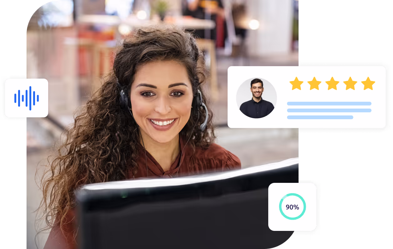
With over 40 years of experience as an industry leader and partnerships that span the world’s top technology providers, TTEC Digital is uniquely suited to address your toughest customer experience challenges. Our experts will provide actionable insights and recommendations at every step while our proven methodology will help you optimize your contact center operations, improve customer satisfaction, and drive business success.
Bold text over bullets
- Bullet 1
- Bullet 2
- Bullet 3
- Sub bullet 1
- Sub bullet 2
- Sub bullet
Text under bullets
Why work at TTEC Digital?


Comprehensive solutions for every CX challenge
Explore our tailored solutions, from omnichannel engagement to AI-powered analytics, designed to meet the unique needs of your business and industry.


